




评分:
这是一个修改自Sigma9的版式,基于21世纪初的WindowsXP风格,由  meowait 开发。
在你的作品开头添加如下语法以应用此版式:
[[include :scp-wiki-cn:theme:winxp]]
示例
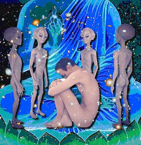
新纪元
可通过五个连字符“-----”创建水平分割线。若它未被放在其他部件(诸如引用块)中,则会左右延伸贯穿页面。这种将文件分割为多个部分的线就是分割线。
标题可通过在一行字起始处输入1至6个加号“+”来创建
+ 标题
1 级标题
2 级标题
3 级标题
4 级标题
5 级标题
6 级标题
此为分页(tab view)。
用Sigma9,做Sigma蝻人
上古帝国银河联邦向我们的帝国发出公函,要求我国皇帝[first_leader.GetName]与银河联邦无上大圆满救苦救世佛公主[galaxy_princess.GetName]进行联姻。
对方称这是宇宙系统下量子退相干层面的因缘和合使得我国皇帝[first_leader.GetName]与银河联邦无上大圆满救苦救世佛公主[galaxy_princess.GetName]之间埋下了缘起的种子。联姻与佛法的皈依将拯救数十颗行星上的居民,让他们脱离苦海。
对方的舰队已经逼近了我们的星系,他们声称:“如果贵帝国不同意联邦的请求,那么未来将使用舍利子大慈大悲救苦轨道轰炸让贵国感受业力回馈。”
来自千禧年的沉闷黄色,我在喝产自中国河北的杏仁露。它们不喜欢它,这大抵是有人用符号暴力来区隔它们。场与场之间,宜居到死区,上千个场域之间的转换,速切,加速主义的庸俗化。我大概可以看到平滑空间内,眼耳鼻舌皆被刺破,俨然一具无器官的身体。
那应该叫无面灵?肢团应该也没有眼睛,那我来对地方了。Windows98的夏天,虫鸣,鼠标框选出一片靛蓝。没有国家的世界,人们认为层级之间的生活是游牧的。你好,世界夫人,再见;我并未见证你年轻的样貌,人人都说你曾年轻过。可乐瓶盖被圆规扎出几个洞孔,爷爷喜欢用它给花浇水。
黄金时代的科幻带有一种辉格式的傲慢,傲慢到以为自己能抚平一切仇恨与对立。有谁构想过恒星系之间的期货贸易?这是一条横亘在四维时空上的巨构。那还会有政治实体吗?曼荼罗一样的结构,解辖域化,星际帝国是萨曼塔体系。
伤口隐隐作痛,我的神经和世界在相互作用。蓝色钴玻璃的旋转餐厅,我没去过,我和它有过相互作用。狄瓦斯坦的千禧年是支离破碎的,他们说有希望,他们说完蛋了。笑魇追赶我,从我的意生身穿过。值得嗤笑的时代,它沉寂在双星物语的音乐中了吗。
维克多·崔死在1990年,狄瓦斯坦的政变在1992年,yakui maid的女仆音乐会受到宗教迫害吗?生动活泼的深红之王,赫鲁晓夫楼轻轻推动祂的摇篮。我应该播放King Crimson音乐。无调性和循环语句,最早的音乐本就没有乐理。这是循环吗‘
for (int millennium = -3000; ; millennium += 1000) {
boolean isY2K = (millennium == 2000);
String conflict = isY2K ? "Digital Dawn" : "Blood and Iron";
System.out.printf("%s: %s cycles anew…\n",
isY2K ? "[Y2K]" : "Year " + millennium, conflict);
if (millennium >= 3000) millennium = -3000;
Thread.sleep(1000);
}
我想在都灵骑那匹被虐待的马,拉斯柯尼科夫扑向米柯尔卡。我没有道德,因此我没有奴隶道德。
这是一个引用块,在一行字的起始处加上“> ”来创建。
更多文字
一条分割线
嵌套引用块
| 这是 | 表格 |
|---|---|
| 你应该老早 | 就知道怎么 |
| 做这个了吧 | |
源代码
> 显示代码
@charset "utf-8";
@import url('https://cdn.jsdelivr.net/gh/scp-cn-tech/sigma9@cn/fonts/font-bauhaus.css');
@import url('https://fonts.googleapis.com/earlyaccess/nanumgothic.css');
@import url('https://fonts.googleapis.com/earlyaccess/nanumgothiccoding.css');
@import url('https://maxcdn.bootstrapcdn.com/font-awesome/4.3.0/css/font-awesome.min.css');
/* 多重折叠模块 */
@import url('https://cdn.jsdelivr.net/gh/scp-cn-tech/sigma9@cn/modules/colstyle.min.css');
/* COMMON */
#content-wrap {
position: relative;
margin: 2em auto 0;
max-width: 1040px;
min-height: 1300px;
height: auto !important;
height: 1500px;
}
h1, #page-title {
color: #003366;
padding: 0 0 0.25em;
margin: 0 0 0.6em;
font-weight: normal;
}
h1 {
margin-top: 0.7em;
padding: 0;
font-weight: bold;
}
h2, h3, h4, h5, h6 {
margin: 0.5em 0 0.4em;
padding: 0;
letter-spacing: 1px;
}
#page-title {
border-color: #003366;
}
.meta-title {
border-bottom: solid 1px #003366;
color: #003366;
font-weight: normal;
margin: 0 0 0.6em;
padding: 0 0 0.25em;
font-size: 200%;
}
.meta-title p {
margin: 0;
}
ul {
list-style: square;
}
li, p {
line-height: 141%;
}
a {
color: #0000CC;
text-decoration: none;
background: transparent;
}
a:visited {
color: #660066;
}
a:hover {
text-decoration: underline;
background-color: transparent;
}
#side-bar a:visited {
color: #660066;
}
a.newpage {
color: #0000CC;
text-decoration: none;
background: transparent;
}
.form-control {
width: 95%;
}
/* GLOBAL WIDTH */
#header, #top-bar {
width: 90%;
max-width: 980px;
margin: 0 auto;
}
.mobile-top-bar {
display: none;
position: absolute;
left: 0;
bottom: 0;
z-index: 0;
}
body {
background-color: #ece9d8;
font-size: 0.80em;
color: #333;
}
div#container-wrap {
background: url('https://scpsandboxcn.wikidot.com/local--files/meowait2/css-background-winxp') top left repeat-x;
}
td.name {
width: 40%;
word-break: break-all;
}
td.title {
width: 30%;
}
sup {
vertical-align: top;
position: relative;
top: -0.5em;
}
/* HEADER */
#header {
height: 220px;
position: relative;
z-index: 10;
padding-bottom: 22px; /* FOR MENU */
background: url('http://scpsandboxcn.wikidot.com/local--files/meowait2/404-not-found') 10px 50px no-repeat;
background-size: 150px 150px;
}
/* --- Global XP Button Dimensions (for consistency) --- */
/* These variables can be adjusted to affect all XP-style buttons */
:root {
--xp-button-height: 28px;
--xp-button-min-width: 38px;
--xp-input-height: 24px; /* Slightly smaller than buttons for typical input fields */
}
/* Search Top Box Container */
#search-top-box {
position: absolute;
top: 79px;
right: 9px;
width: 250px;
/* Use flexbox to keep input and button on the same line */
display: flex;
align-items: center; /* Vertically align them */
justify-content: flex-end; /* Align items to the right */
gap: 5px; /* Add some space between the input and button */
}
#search-top-box-input {
/* Windows XP style borders */
border: 1px solid #7F9DB9; /* A common XP border color */
border-right-color: #C1D2EE;
border-bottom-color: #C1D2EE;
border-top-color: #A6BFDC;
border-left-color: #A6BFDC;
border-radius: 0; /* XP had sharp corners */
padding: 3px 5px; /* Adjust padding for better look */
font-family: 'Tahoma', 'Verdana', sans-serif; /* Common XP fonts */
font-size: 13px; /* Standard font size */
color: #000; /* Text color */
background-color: #FFFFFF; /* White background for input */
box-shadow: inset 1px 1px 2px rgba(0,0,0,.2); /* Subtle inner shadow */
flex-grow: 1; /* Allow input to take available space */
}
#search-top-box-input:hover,
#search-top-box-input:focus {
border-color: #7F9DB9; /* Maintain consistent border on hover/focus */
outline: none; /* Remove default focus outline */
box-shadow: inset 1px 1px 2px rgba(0,0,0,.3); /* Slightly stronger inner shadow */
}
#search-top-box-form input[type=submit] {
/* Windows XP button styling */
border: 1px solid;
border-color: #0A246A #0A246A #0A246A #0A246A; /* Darker border for pressed look */
border-radius: 2px; /* Slight roundness for XP buttons */
padding: 3px 10px; /* Comfortable padding */
font-size: 12px; /* Smaller font size for button text */
font-weight: normal; /* Normal weight for XP buttons */
font-family: 'Tahoma', 'Verdana', sans-serif;
color: #fff; /* Black text for buttons */
/* Gradient for the button - using the 245DDB color */
background: linear-gradient(to bottom, #417AC9 0%, #245DDB 100%);
box-shadow: 1px 1px 2px rgba(0,0,0,.3); /* Subtle outer shadow */
cursor: pointer;
/* Text shadow for a slight embossed effect */
text-shadow: 1px 1px 0 rgba(255,255,255,0.7);
/* For the default state, let's slightly adjust the border to mimic XP's raised look */
border-top-color: #B2D0EA;
border-left-color: #B2D0EA;
border-right-color: #5587B8;
border-bottom-color: #5587B8;
}
#search-top-box-form input[type=submit]:hover {
/* Slightly darker gradient on hover */
background: linear-gradient(to bottom, #F0F7FE 0%, #E2F0FE 50%, #D4E8FB 100%);
border-color: #B2D0EA #5587B8 #5587B8 #B2D0EA; /* Invert border colors for hover effect */
box-shadow: 1px 1px 3px rgba(0,0,0,.4);
}
#search-top-box-form input[type=submit]:focus {
/* Focus state similar to hover, but with a distinct outline if needed */
outline: 1px dotted #000; /* Classic dotted focus outline */
outline-offset: -2px;
}
#search-top-box-form input[type=submit]:active {
/* Pressed state for the button */
border-color: #0A246A; /* Darker border all around */
background: linear-gradient(to bottom, #C4DCF6 0%, #D3E7FA 50%, #E3EEFC 100%); /* Invert gradient for pressed look */
box-shadow: inset 1px 1px 2px rgba(0,0,0,.4); /* Inner shadow for pressed effect */
padding: 4px 9px 2px 11px; /* Shift content slightly down and right */
text-shadow: none; /* Remove text shadow when pressed */
}
#login-status {
color: #aaa;
font-size: 90%;
z-index: 30;
}
#login-status a {
background: transparent;
color: #ddd;
}
#login-status ul a {
color: #700;
background: transparent;
}
#account-topbutton {
background: #ccc;
color: #700;
}
.printuser img.small {
margin-right: 1px;
}
#header h1 {
margin-left: 120px;
padding: 0;
float: left;
max-height: 95px;
}
#header h2 {
margin-left: 120px;
padding: 0;
clear: left;
float: left;
font-size: 105%;
max-height: 38px;
}
#header h1 a {
display: block;
margin: 0;
padding: 80px 0 25px;
line-height: 0px;
max-height: 0;
color: transparent;
background: transparent;
font-size: 0%;
text-decoration: none;
}
#header h1 a::before {
content: "倒措哋噺姩芉";
font-size: 40px !important;
color: var(--text-color);
}
#header h2 span {
display: block;
margin: 0;
padding: 19px 0;
line-height: 0px;
font-size: 0%;
max-height: 0;
color: transparent;
}
/* TOP MENU */
#top-bar {
position: absolute;
top: 213px;
right: auto;
width: 100%;
height: 26px;
line-height: 26px;
padding: 1;
margin: 0 auto;
z-index: 20;
font-size: 90%;
}
#top-bar ul {
float: right;
}
#top-bar li {
margin: 0;
}
#top-bar a {
color: #fff;
background: transparent;
}
#top-bar ul li {
border: 0;
position: relative;
}
#top-bar ul li ul {
border: solid 1px #666;
box-shadow: 0 2px 6px rgba(0,0,0,.5);
border-width: 0 1px 1px 1px;
width: auto;
}
#top-bar ul li a {
border-left: solid 1px rgba(64,64,64,.1);
border-right: solid 1px rgba(64,64,64,.1);
text-decoration: none;
padding-top: 10px;
padding-bottom: 10px;
line-height: 1px;
max-height: 1px;
overflow: hidden;
}
#top-bar ul li.sfhover a,
#top-bar ul li:hover a {
background: #7c9ee6;
color: #fff;
border-left: solid 1px rgba(64,64,64,1);
border-right: solid 1px rgba(64,64,64,1);
}
#top-bar ul li.sfhover ul li a,
#top-bar ul li:hover ul li a {
border-width: 0;
width: 150px;
border-top: 1px solid #7c9ee6;
line-height: 160%;
height: auto;
max-height: none;
padding-top: 0;
padding-bottom: 0;
}
#top-bar ul li.sfhover a:hover,
#top-bar ul li:hover a:hover {
background: #7c9ee6;
text-decoration: none;
}
#top-bar ul li ul li,
#top-bar ul li ul li.sfhover,
#top-bar ul li ul li:hover {
border-width: 0;
}
#top-bar ul li ul li a {
border-width: 0;
}
#top-bar ul li ul a, #top-bar a:hover {
color: #a01;
}
.top-bar ul li:last-of-type ul {
right: 0;
}
/* IE7 HACK */
#top-bar ul > li > ul {
*margin-top: -4px;
}
/* SIDE MENU */
#side-bar {
clear: none;
float: none;
position: absolute;
top: 0.5em;
left: 2em;
width: 17em;
padding: 0;
border: none; /* We'll manage the border with the new structure */
display: block;
overscroll-behavior: contain;
/* Basic Windows XP window appearance */
background-color: #ECE9D8; /* Standard XP window background */
border: 1px solid #808080; /* Standard XP window border */
box-shadow: 2px 2px 5px rgba(0,0,0,0.3); /* Subtle outer shadow for window effect */
}
/* Windows XP Title Bar */
#side-bar::before {
content: "Sidebar"; /* You can change this title */
display: block;
height: 20px; /* Standard XP title bar height */
line-height: 20px;
padding: 0 5px;
background: linear-gradient(to right, #0A246A, #245DDB); /* Deep blue XP gradient */
color: #FFFFFF;
font-family: 'Tahoma', 'Verdana', sans-serif;
font-size: 11px;
font-weight: bold;
white-space: nowrap;
overflow: hidden;
text-overflow: ellipsis;
border-bottom: 1px solid #0A246A; /* Darker line below title bar */
position: relative; /* For button positioning */
}
/* Decorative Window Layout Buttons (Minimize, Maximize, Close) */
#side-bar::after {
content: "─ □ ×"; /* Unicode characters for the buttons */
position: absolute;
top: 0;
right: 3px; /* Adjust as needed */
height: 20px;
line-height: 20px;
font-family: 'Marlett', sans-serif; /* Marlett font is used for these symbols in Windows */
font-size: 10px; /* Adjust size for visual balance */
color: #C0D0EF; /* Light color for buttons */
cursor: default; /* Indicate they are decorative */
letter-spacing: 2px; /* Space out the buttons */
text-shadow: 1px 1px 0 rgba(0,0,0,0.5); /* Subtle shadow for depth */
}
#side-bar .side-block {
padding: 8px; /* Slightly less padding */
border: 1px solid #A0A0A0; /* Lighter gray border for inner blocks */
border-radius: 0; /* No rounded corners for XP */
box-shadow: inset 1px 1px 2px rgba(0,0,0,.1); /* Subtle inner shadow */
background: #F0F0F0; /* Slightly off-white background for blocks */
margin: 10px; /* Margin within the XP window */
}
#side-bar .side-area {
padding: 5px; /* Adjust padding */
}
#side-bar .heading {
color: #000; /* Black text for headings */
border-bottom: solid 1px #B8CFEC; /* Lighter blue-gray line */
padding-left: 0; /* Remove padding-left from heading */
margin-bottom: 5px;
font-size: 11px; /* Standard XP font size */
font-weight: bold;
font-family: 'Tahoma', 'Verdana', sans-serif;
}
#side-bar .heading:not(:first-child) {
margin-top: 10px;
}
#side-bar p {
margin: 0;
font-family: 'Tahoma', 'Verdana', sans-serif;
font-size: 11px;
color: #333;
}
#side-bar div.menu-item {
margin: 2px 0;
font-family: 'Tahoma', 'Verdana', sans-serif;
font-size: 11px;
}
#side-bar div.menu-item img {
width: 13px;
height: 13px;
border: 0;
margin-right: 2px;
position: relative;
bottom: -2px;
}
#side-bar div.menu-item a {
font-weight: normal; /* Less bold for links */
color: #0000FF; /* Standard blue link color */
text-decoration: none; /* No underline by default */
}
#side-bar div.menu-item a:hover {
text-decoration: underline; /* Underline on hover */
}
#side-bar div.menu-item.inactive img {
opacity: 0.4; /* Slightly less opaque */
}
#side-bar div.menu-item.inactive a {
color: #808080; /* Gray for inactive links */
}
#side-bar div.menu-item .sub-text {
font-size: 90%; /* Slightly larger sub-text */
color: #666;
}
/* Collapsible Block adjustments for XP look */
#side-bar .collapsible-block-folded {
background: url('https://raw.githubusercontent.com/Anatoliy-Karpenko/Windows-XP-Theme-for-Web/main/images/plus.png') 0 2px no-repeat; /* Replace with XP-style plus icon */
background-size: 12px 12px;
}
#side-bar .collapsible-block-unfolded-link {
border-bottom: solid 1px #B8CFEC; /* Consistent with heading border */
}
#side-bar .collapsible-block-unfolded-link .collapsible-block-link {
margin-top: 10px;
margin-bottom: 5px;
font-size: 11px; /* Consistent font size */
color: #000; /* Black for unfolded link heading */
}
#side-bar .collapsible-block-unfolded-link .collapsible-block-link:hover {
color: #0000FF; /* Standard link hover color */
text-decoration: underline;
}
#side-bar ul {
list-style-type: none;
padding: 0 5px 0;
}
div.scpnet-interwiki-wrapper {
margin: -4px -6px 1em; /* Adjust margins to fit within the new window structure */
min-height: 300px;
}
iframe.scpnet-interwiki-frame {
width: 100%;
height: 0;
border: none;
overflow-y: hidden;
}
/* CONTENT */
#main-content {
margin: 0 2em 0 22em;
padding: 1em;
position: relative;
}
/* ACTUALLY HIDE HIDDEN TAGS */
#main-content .page-tags a[href^='/system:page-tags/tag/_'] {
display: none;
}
#breadcrumbs {
margin: -1em 0 1em;
}
.pseudocrumbs {
margin: -1em 0 1em;
}
/* YUI-TABS - Windows XP Window Style */
.yui-navset {
/* Main window container */
background-color: #ECE9D8; /* Standard XP window background */
border: 1px solid #808080; /* Standard XP window border */
box-shadow: 2px 2px 5px rgba(0,0,0,0.3); /* Subtle outer shadow for window effect */
padding-top: 25px; /* Space for the title bar */
position: relative; /* For the title bar and buttons */
}
/* Windows XP Title Bar (Decorative) */
.yui-navset::before {
content: "Document Viewer"; /* You can customize the window title */
display: block;
position: absolute;
top: 0;
left: 0;
right: 0;
height: 20px; /* Standard XP title bar height */
line-height: 20px;
padding: 0 5px;
background: linear-gradient(to right, #0A246A, #245DDB); /* Deep blue XP gradient */
color: #FFFFFF;
font-family: 'Tahoma', 'Verdana', sans-serif;
font-size: 11px;
font-weight: bold;
white-space: nowrap;
overflow: hidden;
text-overflow: ellipsis;
border-bottom: 1px solid #0A246A; /* Darker line below title bar */
z-index: 1; /* Ensure title bar is above content */
}
/* Decorative Window Layout Buttons (Minimize, Maximize, Close) */
.yui-navset::after {
content: "─ □ ×"; /* Unicode characters for the buttons */
position: absolute;
top: 0;
right: 3px; /* Adjust as needed */
height: 20px;
line-height: 20px;
font-family: 'Marlett', sans-serif; /* Marlett font for these symbols */
font-size: 10px; /* Adjust size for visual balance */
color: #C0D0EF; /* Light color for buttons */
cursor: default; /* Indicate they are decorative */
letter-spacing: 2px; /* Space out the buttons */
text-shadow: 1px 1px 0 rgba(0,0,0,0.5); /* Subtle shadow for depth */
z-index: 2; /* Ensure buttons are above title bar */
}
/* Content Area - Mimics the main white/off-white content panel */
.yui-navset .yui-content {
background: #f0efe8; /* Lighter background for the content area */
border: 1px solid #000; /* Light blue border for the content area */
border-top: none; /* No top border, as tabs will sit on top */
padding: 10px; /* Add some padding inside the content */
margin: 0 5px 5px 5px; /* Keep content slightly inset from the main window border */
min-height: 150px; /* Ensure content area has some height */
overflow: auto; /* Allow scrolling if content overflows */
}
/* Tab Navigation - The "Browser Tabs" part */
.yui-navset .yui-nav,
.yui-navset .yui-navset-top .yui-nav {
border-bottom: 1px solid #A0A0A0; /* Darker line below tabs */
padding: 0 5px; /* Adjust padding to align tabs */
background-color: #ECE9D8; /* Match window background */
display: flex; /* Use flexbox for better tab arrangement */
flex-wrap: wrap; /* Allow tabs to wrap if too many */
margin-top: -5px; /* Pull tabs up slightly into the title bar area */
}
.yui-navset li {
line-height: normal;
list-style: none; /* Remove bullet points */
margin-right: 2px; /* Space between tabs */
padding: 0; /* Remove default list item padding */
}
.yui-navset .yui-nav a,
.yui-navset .yui-navset-top .yui-nav a {
display: block;
padding: 4px 12px; /* Padding for tab text */
font-family: 'Tahoma', 'Verdana', sans-serif;
font-size: 11px;
color: #000; /* Default tab text color */
text-decoration: none;
white-space: nowrap; /* Prevent text wrapping */
/* Basic tab shape - mimics browser tabs */
background-color: #D4D0C8; /* Default tab background */
border: 1px solid #A0A0A0; /* Default tab border */
border-bottom: none; /* No bottom border for tabs */
border-top-left-radius: 4px; /* Slight rounding for tab corners */
border-top-right-radius: 4px;
position: relative;
top: 1px; /* Overlap the bottom border of the nav */
box-shadow: inset 0 1px 0 rgba(255,255,255,0.7); /* Subtle inner highlight */
}
/* Hover state for tabs */
.yui-navset .yui-nav a:hover,
.yui-navset .yui-nav a:focus {
background: #E1FFFF; /* Lighter on hover */
text-decoration: none;
border: #808080; /* Darker border on hover */
cursor: pointer;
outline: none; /* Remove default focus outline */
}
/* Selected tab style */
.yui-navset .yui-nav .selected a,
.yui-navset .yui-nav .selected a:focus,
.yui-navset .yui-nav .selected a:hover {
background: #0f3082; /* Matches content area background */
color: #FFF; /* Black text for selected tab */
border: #B8CFEC; /* Border matches content area border */
border-bottom: #F8F8F8; /* Hide bottom border to merge with content */
top: 1px; /* Keep it aligned */
box-shadow: none; /* Remove inner shadow for selected tab */
z-index: 10; /* Bring selected tab to front */
font-weight: bold; /* Bold text for selected tab */
}
/* FOOTER */
#footer {
clear: both;
font-size: 77%;
background: #444;
color: #bbb;
margin-top: 15px;
padding: 3px 10px;
}
#footer .options {
visibility: visible;
display: block;
float: right;
width: 50%;
font-size: 100%;
text-align: right;
}
#footer a {
color: #fff;
background: transparent;
}
/* SOME NICE BOXES */
div.sexy-box {
background: #eee;
border: 1px solid #ccc;
padding: 0 10px 12px;
margin: 7px 4px 12px;
overflow: hidden;
}
div.sexy-box div.image-container img {
margin: 5px;
padding: 2px;
border: 1px solid #999;
}
/* Custom page content classes */
#page-content {
min-height: 720px;
}
.unmargined > p {
margin: 0;
line-height: 100%;
}
.content-panel {
border: solid 1px #888880;
border-radius: 10px;
background-color: #999990;
margin: 10px 0 15px;
box-shadow: 3px 3px 6px #bbb;
box-shadow: 0 2px 6px rgba(0,0,0,0.5), inset 0 1px rgba(255,255,255,0.3), inset 0 10px rgba(255,255,255,0.2), inset 0 10px 20px rgba(255,255,255,0.25), inset 0 -15px 30px rgba(0,0,0,0.1);
}
.content-panel.standalone {
background: #fcfdfb;
}
.content-panel.series {
padding: 0 20px;
margin-bottom: 20px;
}
.content-panel.centered {
text-align: center;
}
.content-panel.left-column {
float: left;
width: 48%;
}
.content-panel.right-column {
float: right;
width: 48%;
}
.content-panel .panel-heading {
padding: 2px 10px;
color: #fff;
font-size: 90%;
font-weight: bold;
text-shadow: 1px 1px 2px rgba(0,0,0,.35);
}
.content-panel .panel-heading > p,
.content-panel .panel-footer > p {
margin: 0;
}
.content-panel .panel-body {
padding: 5px 10px;
background: #fff9f0 url('https://scp-wiki-cn.wdfiles.com/local--files/component%3Atheme/panel-bg-gradient-reverse.png') bottom repeat-x;
}
.content-panel .panel-footer {
padding: 1px 10px;
color: #fffff0;
font-size: 80%;
font-weight: bold;
text-align: right;
text-shadow: 1px 1px 2px rgba(0,0,0,.5);
}
.content-panel .panel-footer a {
color: #fff;
}
.content-panel .content-toc {
float: right;
padding: 0 20px;
background-color: #fff;
border: solid 1px #ccc;
border-radius: 10px;
margin: 20px 0 5px 5px;
white-space: nowrap;
box-shadow: inset 1px 2px 6px rgba(0,0,0,.15);
}
.alternate:nth-child(even) {
background-color: rgba(255,255,255,.9);
}
/* --- 通用按钮尺寸变量 (方便统一管理) --- */
/* 可以根据实际需求调整这些值 */
:root {
--xp-button-height: 28px;
--xp-button-min-width: 38px; /* 略大于高度,给文本留出空间 */
--xp-icon-button-size: 28px; /* 用于方形图标按钮 */
}
/* Page Rating Module Customizations - Windows XP Window Theme Style */
.page-rate-widget-box {
display: inline-flex;
border: 1px solid #0A246A; /* 更深的XP窗口边框蓝色 */
border-radius: 4px;
background: linear-gradient(to bottom, #ECE9D8 0%, #D8D4C8 100%); /* XP 按钮的浅灰渐变背景 */
box-shadow: 2px 2px 5px rgba(0, 0, 0, 0.2), inset 0 0 1px rgba(255, 255, 255, 0.8);
margin-bottom: 10px;
margin-right: 2em;
font-family: 'Trebuchet MS', 'Arial', sans-serif;
font-size: 0.9em;
overflow: hidden;
color: #333333; /* 默认文本颜色 */
}
/* 评分点数显示区域 */
.page-rate-widget-box .rate-points {
background: linear-gradient(to bottom, #417AC9 0%, #245DDB 100%); /* XP 窗口标题蓝色的渐变 */
border: 1px solid #245DDB; /* 与背景主色匹配 */
border-right: none;
border-radius: 3px 0 0 3px;
color: #FFFFFF; /* 白色文字,与XP标题栏一致 */
font-weight: bold;
padding: 4px 8px; /* 内部填充 */
display: flex;
align-items: center;
justify-content: center;
text-shadow: 1px 1px 2px rgba(0, 0, 0, 0.4);
box-shadow: inset 1px 1px 3px rgba(0, 0, 0, 0.2);
/* 设定高度,与按钮一致 */
height: var(--xp-button-height);
box-sizing: border-box; /* 确保 padding 不增加总高度 */
}
/* 赞成和反对按钮容器 - Flexbox 确保内容居中 */
.page-rate-widget-box .rateup,
.page-rate-widget-box .ratedown {
background: transparent;
border: none;
padding: 0;
font-weight: bold;
display: flex;
align-items: center;
justify-content: center;
/* 设定高度 */
height: var(--xp-button-height);
/* 设定最小宽度,确保一致性 */
min-width: var(--xp-button-min-width);
box-sizing: border-box;
}
/* 赞成和反对链接本身 */
.page-rate-widget-box .rateup a,
.page-rate-widget-box .ratedown a {
background: transparent;
color: #333333;
padding: 0 8px; /* 调整 padding 以便 min-width 和 height 生效 */
margin: 0;
text-decoration: none;
display: flex; /* 使用 flexbox 确保文本在 a 标签内居中 */
align-items: center;
justify-content: center;
width: 100%; /* 填充父容器宽度 */
height: 100%; /* 填充父容器高度 */
border-right: 1px solid #C0C0C0;
box-shadow: inset 1px 1px 0px rgba(255, 255, 255, 0.5);
transition: all 0.1s ease-in-out;
text-shadow: 1px 1px 0px rgba(255, 255, 255, 0.5);
}
.page-rate-widget-box .ratedown a {
border-right: none;
}
/* 赞成和反对链接的悬停/活动效果 (保持不变) */
.page-rate-widget-box .rateup a:hover,
.page-rate-widget-box .ratedown a:hover {
background: linear-gradient(to bottom, #C6DBEE 0%, #AECFE6 100%);
color: #000000;
text-decoration: none;
box-shadow: inset 1px 1px 3px rgba(0, 0, 0, 0.1);
}
.page-rate-widget-box .rateup a:active,
.page-rate-widget-box .ratedown a:active {
background: #7DA9DD;
box-shadow: inset 1px 1px 5px rgba(0, 0, 0, 0.3);
transform: translateY(1px);
}
/* 取消按钮 - 模拟 Windows XP 关闭按钮的红色 */
.page-rate-widget-box .cancel {
background: linear-gradient(to bottom, #EF744D 0%, #E34D1F 100%);
border: 1px solid #E34D1F;
border-left: none;
border-radius: 0 3px 3px 0;
display: flex;
align-items: center;
justify-content: center;
box-shadow: inset 0 0 1px rgba(255, 255, 255, 0.8);
/* 设定高度和最小宽度 */
height: var(--xp-button-height);
min-width: var(--xp-button-min-width); /* 确保与普通按钮宽度一致 */
box-sizing: border-box;
}
.page-rate-widget-box .cancel a {
background: transparent;
text-transform: uppercase;
color: #FFFFFF;
padding: 0 8px; /* 调整 padding 以便 min-width 和 height 生效 */
text-decoration: none;
display: flex; /* 使用 flexbox 确保文本在 a 标签内居中 */
align-items: center;
justify-content: center;
width: 100%; /* 填充父容器宽度 */
height: 100%; /* 填充父容器高度 */
transition: all 0.1s ease-in-out;
text-shadow: 1px 1px 2px rgba(0, 0, 0, 0.4);
}
.page-rate-widget-box .cancel a:hover {
background: linear-gradient(to bottom, #E34D1F 0%, #EF744D 100%);
color: #FFFFFF;
text-decoration: none;
box-shadow: inset 1px 1px 3px rgba(0, 0, 0, 0.2);
}
.page-rate-widget-box .cancel a:active {
background: #BC3D19;
box-shadow: inset 1px 1px 5px rgba(0, 0, 0, 0.4);
transform: translateY(1px);
}
/* --- Info Pane --- */
/* 主要信息框容器 - 类似一个小型 XP 窗口或对话框 */
.rate-box-with-credit-button {
background: linear-gradient(to bottom, #ECE9D8 0%, #D8D4C8 100%);
border: 1px solid #0A246A !important;
border-radius: 4px !important;
box-shadow: 2px 2px 5px rgba(0, 0, 0, 0.2), inset 0 0 1px rgba(255, 255, 255, 0.8) !important;
margin-bottom: 10px;
margin-right: 2em;
padding: 2px;
display: inline-flex;
align-items: center;
font-family: 'Trebuchet MS', 'Arial', sans-serif;
color: #333333;
}
/* 信息图标 (fa-info) - 作为一个拟物化按钮 */
.rate-box-with-credit-button .fa-info {
/* 使用你指定的 #245ddb 及其近似色作为背景 */
background: linear-gradient(to bottom, #417AC9 0%, #245DDB 100%) !important; /* XP 窗口标题蓝色的渐变 */
border: 1px solid #245DDB !important; /* 与背景主色匹配 */
border-radius: 3px !important;
color: #FFFFFF !important; /* 白色图标颜色 */
font-size: 1.1em;
cursor: pointer;
box-shadow: 1px 1px 2px rgba(0, 0, 0, 0.1), inset 0 0 1px rgba(255, 255, 255, 0.7) !important;
transition: all 0.1s ease-in-out;
margin-right: 5px;
text-shadow: 1px 1px 2px rgba(0, 0, 0, 0.4); /* 更明显的白色文字阴影 */
/* 设定统一的方形尺寸 */
width: var(--xp-icon-button-size);
height: var(--xp-icon-button-size);
display: flex; /* 确保图标居中 */
align-items: center;
justify-content: center;
box-sizing: border-box;
}
.rate-box-with-credit-button .fa-info:hover {
/* 悬停时反向渐变或略微变亮 */
background: linear-gradient(to bottom, #245DDB 0%, #417AC9 100%) !important; /* 反向渐变或更深的蓝色 */
color: #FFFFFF !important;
box-shadow: inset 1px 1px 3px rgba(0, 0, 0, 0.2) !important;
}
.rate-box-with-credit-button .fa-info:active {
background: #1A4CA3 !important; /* 按下时更深的蓝色 */
box-shadow: inset 1px 1px 5px rgba(0, 0, 0, 0.4) !important;
transform: translateY(1px);
}
/* 评分框内的取消按钮(如果存在)*/
.rate-box-with-credit-button .cancel {
background: linear-gradient(to bottom, #EF744D 0%, #E34D1F 100%) !important;
border: 1px solid #E34D1F !important;
border-radius: 3px !important;
color: #FFFFFF !important;
font-weight: bold;
text-transform: uppercase;
cursor: pointer;
box-shadow: 1px 1px 2px rgba(0, 0, 0, 0.2), inset 0 0 1px rgba(255, 255, 255, 0.8) !important;
transition: all 0.1s ease-in-out;
text-shadow: 1px 1px 2px rgba(0, 0, 0, 0.4);
margin-left: 5px;
/* 设定高度和最小宽度 */
height: var(--xp-button-height);
min-width: var(--xp-button-min-width);
display: flex; /* 确保文本居中 */
align-items: center;
justify-content: center;
box-sizing: border-box;
padding: 0 8px; /* 调整 padding 适应 min-width */
}
.rate-box-with-credit-button .cancel:hover {
background: linear-gradient(to bottom, #E34D1F 0%, #EF744D 100%) !important;
color: #FFFFFF !important;
box-shadow: inset 1px 1px 3px rgba(0, 0, 0, 0.2) !important;
}
.rate-box-with-credit-button .cancel:active {
background: #BC3D19 !important;
box-shadow: inset 1px 1px 5px rgba(0, 0, 0, 0.4) !important;
transform: translateY(1px);
}
/* 模态框 (Modalbox) (保持不变,因为不直接是按钮) */
.modalbox {
background: linear-gradient(to bottom, #F0F0F0 0%, #D0D0D0 100%) !important;
border: 1px solid #0A246A !important;
border-radius: 6px !important;
box-shadow: 8px 8px 20px rgba(0, 0, 0, 0.5) !important;
font-family: 'Trebuchet MS', 'Arial', sans-serif;
color: #333333;
padding: 15px;
}
/* 模态框内的关闭/返回按钮 (close-credits, credit-back) */
.close-credits,
.credit-back {
display: inline-flex; /* 使用 inline-flex 确保内容居中 */
align-items: center;
justify-content: center;
padding: 0 12px; /* 调整 padding 以配合 min-width 和 height */
margin: 5px;
border: 1px solid #7F9DB9;
border-radius: 4px;
background: linear-gradient(to bottom, #EF744D 0%, #e34d1f 100%);
box-shadow: 2px 2px 3px rgba(0, 0, 0, 0.2), inset 0 0 1px rgba(255, 255, 255, 0.8);
color: #FFFFFF;
text-decoration: none;
font-weight: bold;
cursor: pointer;
text-shadow: 1px 1px 0px rgba(255, 255, 255, 0.5);
transition: all 0.1s ease-in-out;
filter: none;
/* 设定统一的尺寸 */
height: var(--xp-button-height);
min-width: var(--xp-button-min-width);
box-sizing: border-box;
}
.close-credits:hover,
.credit-back:hover {
background: linear-gradient(to bottom, #E34D1F 0%, #EF744D 100%);
box-shadow: 1px 1px 2px rgba(0, 0, 0, 0.1), inset 1px 1px 2px rgba(0, 0, 0, 0.1);
transform: translateY(1px);
color: #ffffff;
}
.close-credits:active,
.credit-back:active {
background: #C0C0C0;
box-shadow: inset 1px 1px 3px rgba(0, 0, 0, 0.3);
transform: translateY(1px);
}
/* Fixes for multi-line page tags */
#main-content .page-tags {
margin: 1em 0 0;
padding: 0;
}
#main-content .page-tags span {
display: inline-block;
padding: 0;
max-width: 60%;
}
#main-content .page-tags a {
display: inline-block;
white-space: nowrap;
}
/* Standard Image Block - Windows XP Window Style */
.scp-image-block {
/* Main window container properties */
background-color: #ECE9D8; /* Standard XP window background */
border: 1px solid #808080; /* Standard XP window border */
box-shadow: 2px 2px 5px rgba(0,0,0,0.3); /* Subtle outer shadow for window effect */
width: 300px; /* Keep original width */
position: relative; /* For the title bar and buttons */
padding-top: 20px; /* Space for the title bar */
overflow: hidden; /* Ensure content stays within bounds */
font-family: 'Tahoma', 'Verdana', sans-serif; /* XP standard font */
}
/* Windows XP Title Bar (Decorative) */
.scp-image-block::before {
content: "Image Viewer"; /* You can customize the window title */
display: block;
position: absolute;
top: 0;
left: 0;
right: 0;
height: 20px; /* Standard XP title bar height */
line-height: 20px;
padding: 0 5px;
background: linear-gradient(to right, #0A246A, #245DDB); /* Deep blue XP gradient */
color: #FFFFFF;
font-family: 'Tahoma', 'Verdana', sans-serif;
font-size: 11px;
font-weight: bold;
white-space: nowrap;
overflow: hidden;
text-overflow: ellipsis;
border-bottom: 1px solid #0A246A; /* Darker line below title bar */
z-index: 1; /* Ensure title bar is above content */
}
/* Decorative Window Layout Buttons (Minimize, Maximize, Close) */
.scp-image-block::after {
content: "─ □ ×"; /* Unicode characters for the buttons */
position: absolute;
top: 0;
right: 3px; /* Adjust as needed */
height: 20px;
line-height: 20px;
font-family: 'Marlett', sans-serif; /* Marlett font for these symbols */
font-size: 10px; /* Adjust size for visual balance */
color: #C0D0EF; /* Light color for buttons */
cursor: default; /* Indicate they are decorative */
letter-spacing: 2px; /* Space out the buttons */
text-shadow: 1px 1px 0 rgba(0,0,0,0.5); /* Subtle shadow for depth */
z-index: 2; /* Ensure buttons are above title bar */
}
.scp-image-block.block-right {
float: right;
clear: right;
margin: 0 2em 1em 2em;
}
.scp-image-block.block-left {
float: left;
clear: left;
margin: 0 2em 1em 0;
}
.scp-image-block.block-center {
margin-right: auto;
margin-left: auto;
float: none; /* Ensure centering works without float */
}
.scp-image-block img {
border: 1px solid #B4B4B4; /* Light gray border around the image itself */
width: calc(100% - 10px); /* Adjust image width to fit within padding, if any */
display: block; /* Ensure image behaves as a block */
margin: 5px auto; /* Center image within the block, add slight margin */
box-shadow: inset 0 0 2px rgba(0,0,0,0.1); /* Very subtle inner shadow for image */
}
.scp-image-block .scp-image-caption {
background-color: #ECE9D8; /* Match the window background */
border-top: 1px solid #A0A0A0; /* A soft gray border to separate from image */
padding: 5px 0; /* Adjusted padding */
font-size: 10px; /* Standard XP caption size */
font-weight: normal; /* Less bold, more typical for XP captions */
text-align: center;
width: 100%; /* Make caption span full width of the window */
color: #333; /* Darker text for readability */
box-sizing: border-box; /* Include padding/border in width calculation */
}
.scp-image-block > p {
margin: 0;
}
.scp-image-block .scp-image-caption > p {
margin: 0;
padding: 0 10px;
}
/* Wikiwalk Navigation */
.footer-wikiwalk-nav {
font-weight: bold;
font-size: 75%;
}
/* Licensebox */
.licensebox .collapsible-block-link {
margin-left: .25em;
padding: .25em;
font-weight: bold;
opacity: .5;
color: inherit;
-webkit-transition: opacity 0.5s ease-in-out;
-moz-transition: opacity 0.5s ease-in-out;
transition: opacity 0.5s ease-in-out;
}
.licensebox .collapsible-block-link:hover,
.licensebox .collapsible-block-link:active {
opacity: 1;
}
/* Show-Changes Highlights */
.inline-diff ins:first-of-type::before,
.inline-diff del:first-of-type::before,
.inline-diff br + ins::before,
.inline-diff br + del::before {
display: inline-block;
font: normal normal normal 14px/1 FontAwesome;
text-rendering: auto;
-webkit-font-smoothing: antialiased;
-moz-osx-font-smoothing: grayscale;
content: '\f111';
position: absolute;
left: 0.75em;
}
.inline-diff ins::before {
color: #DDF;
}
.inline-diff del::before {
color: #FCC;
}
.inline-diff ins + del::before,
.inline-diff del + ins::before {
color: transparent;
}
/* Forum Customizations */
.forum-thread-box .description-block {
padding: .5em 1em;
border-radius: 10px;
box-shadow: 0 1px 5px rgba(0,0,0,.15), inset 0 1px 0 rgba(255,255,255,.8), inset 0 10px 5px rgba(255,255,255,.25), inset 0 -15px 30px rgba(0,0,0,.1);
}
.thread-container .post .head {
padding: 0.5em 1em;
background-color: #eee;
background: linear-gradient(to right, #eee, #eeecec);
box-shadow: inset 2px 3px 6px rgba(0,0,0,.15);
border-radius: 5px 5px 0 0;
}
.thread-container .post .content {
position: relative;
overflow: hidden;
}
/* Hide Forum Signatures */
.signature {
display: none !important;
}
/* Ruby by Nanimono Demonai */
.ruby, ruby {
display: inline-table;
text-align: center;
white-space: nowrap;
line-height: 1;
height: 1em;
vertical-align: text-bottom;
}
.rt, rt {
display: table-header-group;
font-size: 0.6em;
line-height: 1.1;
text-align: center;
white-space: nowrap;
}
/* Keycap */
.keycap {
border: 1px solid;
border-color: #ddd #bbb #bbb #ddd;
border-bottom-width: 2px;
-moz-border-radius: 3px;
-webkit-border-radius: 3px;
border-radius: 3px;
background-color: #f9f9f9;
padding: 1px 3px;
font-family: inherit;
font-size: 0.85em;
white-space: nowrap;
}
/* tag style */
.tags {
display: inline-block;
margin: 0 0 0 5px;
padding: 3px 5px 3px 0;
height: 13px;
line-height: 13px;
font-size: 11px;
background: #666;
color: #fff;
text-decoration: none;
-moz-border-radius-bottomright: 4px;
-webkit-border-bottom-right-radius: 4px;
border-bottom-right-radius: 4px;
-moz-border-radius-topright: 4px;
-webkit-border-top-right-radius: 4px;
border-top-right-radius: 4px;
}
.tags::before {
content: '';
padding: 0 1px 3px 1px;
float: left;
position: relative;
top: -3px;
left: -10px;
width: 0;
height: 0;
border-color: transparent #666 transparent transparent;
border-style: solid;
border-width: 8px 8px 8px 0;
}
.tags::after {
content: '';
position: relative;
top: 4.5px;
left: -8px;
float: left;
width: 4px;
height: 4px;
-moz-border-radius: 2px;
-webkit-border-radius: 2px;
border-radius: 2px;
background: #fff;
-moz-box-shadow: -1px -1px 2px #004977;
-webkit-box-shadow: -1px -1px 2px #333;
box-shadow: -1px -1px 2px #333;
}
/* Display Black Block by Nanimono Demonai */
.bblock {
color: #000;
background-color: #000;
transition: 2s;
text-decoration: none;
}
.bblock:hover {
background-color: #000;
color: #060;
text-decoration: none;
}
.dblock {
color: #000;
background-color: #000;
transition: 2s;
text-decoration: none;
}
.dblock:hover {
background-color: transparent;
text-decoration: none;
}
/* Blockquote Mimic Div - Windows XP Style */
blockquote,
div.blockquote {
border: #0f3082 outset 2px;
background-color: #ece9d8;
color: black;
color: #000;
}
div.curved {
border-radius: 10px;
margin: 1em 3em;
}
/* Content Warning */
#page-content div#u-adult-warning {
width: fit-content;
margin: 0 auto 1.25rem;
padding: 0.5rem 1rem;
border: 3px solid #333;
background: #e4e4e4;
color: #333;
text-align: center;
font-weight: bold;
}
#page-content div#u-adult-warning > div#u-adult-header {
font-size: 300%;
text-shadow: 1px 2px 3px rgba(0, 0, 0, .5);
color: #901;
}
#page-content div#u-adult-warning > div#u-adult-header p {
margin: 0;
}
#page-content div#u-adult-warning > .error-block {
color: unset;
padding: unset;
margin: unset;
border: unset;
margin-bottom: 1em;
}
#page-content div#u-component-top-box {
max-width: 500px;
margin: 0 auto 1.25rem;
padding: 1rem;
background-color: #b01;
border-radius: 20px;
box-shadow: 0 1px 6px rgba(0,0,0,.25), inset 0 1px 0 rgba(255,255,255,.5), inset 0 10px 1px rgba(255,255,255,.5), inset 0 -15px 30px rgba(0,0,0,.25);
color: #fff;
text-align: center;
font-weight: bold;
}
#page-content div#u-component-top-box > div#u-component-header {
font-size: 300%;
text-shadow: 1px 2px 3px rgba(0,0,0,.5);
}
#page-content div#u-component-top-box > div#u-component-header p {
margin: 0;
}
#page-content div#u-archived-top-box {
max-width: 375px;
margin: 0 auto 1.75rem;
padding: 1rem 1rem 0.5rem;
background-color: #e3e3e3;
border: 2px solid #a1a1a1;
border-radius: 2px;
color: #333;
text-align: center;
}
#page-content div#u-archived-top-box > div#u-archived-header {
font-size: 150%;
font-weight: bold;
}
#page-content div#u-archived-top-box > div#u-archived-header p {
margin: 0;
}
/*
2011-11-13 Minobe Hiroyuki @ Marguerite Site
www.marguerite.jp/Nihongo/WWW/CSSTips/EmphasizeDots-CSS3.html
Edited for the SCP Foundation by Nanimono_Demonai
*/
.emph {
text-emphasis-style: dot;
-webkit-text-emphasis-style: dot;
}
/* For FireFox */
@-moz-document url-prefix() {
.emph {
/* For the environments which comply with CSS3. */
font-family: monospace;
font-style: normal;
font-weight: normal;
background-repeat: repeat-x;
padding: 0.5em 0 0;
background-color: transparent;
background-clip: padding-box, content-box;
background-size: 1em 1.3em, auto;
}
}
/* For IE10 */
@media screen and (-ms-high-contrast: active), (-ms-high-contrast: none) {
.emph {
/* For the environments which comply with CSS3. */
font-family: monospace;
font-style: normal;
font-weight: normal;
background-repeat: repeat-x;
padding: 0.5em 0 0;
background-color: transparent;
background-clip: padding-box, content-box;
background-size: 1em 1.3em, auto;
}
}
/* viewport */
@viewport {
width: device-width;
zoom: 1.0;
}
/* IE viewport */
@-ms-viewport {
width: device-width;
zoom: 1.0;
}
/* opera viewport */
@-o-viewport {
width: device-width;
zoom: 1.0;
}
/* chrome viewport - maybe it isn't work… */
@-webkit-viewport {
width: device-width;
zoom: 1.0;
}
/* firefox viewport - maybe it isn't work too… */
@-moz-viewport {
width: device-width;
zoom: 1.0;
}
/* webkit scrollbar */
::-webkit-scrollbar {
width: 9px; /* for vertical scrollbars */
height: 9px; /* for horizontal scrollbars */
border: solid 1px rgba(0, 0, 0, 0.1);
}
::-webkit-scrollbar-track {
background: rgba(0, 0, 0, 0.1);
}
::-webkit-scrollbar-thumb {
background: rgba(50, 50, 50, 0.3);
}
.page-source {
word-break: break-all;
}
/* Responsive Web Design */
img, embed, video, object, iframe, table {
max-width: 100%;
}
#page-content div, #page-content div table {
max-width: 100%;
}
#edit-page-comments {
width: 100%;
}
/* basic Query for mobile devices */
@media (max-width: 767px) {
.owindow {
min-width: 80%;
max-width: 99%;
}
.modal-body .table, .modal-body .table ~ div {
float: left;
}
.owindow .button-bar {
float: right;
}
.owindow div a.btn-primary {
width: 100%;
float: left;
}
.mobile-top-bar ul li:last-of-type ul {
right: 0;
}
span, a, #action-area td {
word-break: break-all;
}
}
/* Mobile Media Query */
@media (max-width: 479px) {
#search-top-box-input {
width: 5em;
}
#page-content {
font-size: 0.9em;
}
#main-content {
margin: 0;
}
#recent-posts-category {
width: 100%;
}
#header {
max-width: 90%;
}
#side-bar {
width: 80%;
position: relative;
}
.top-bar {
display: none;
}
.mobile-top-bar {
display: block;
padding: 0;
}
.page-options-bottom a {
padding: 0 4px;
}
#header h1 a {
font-size: 0%;
}
blockquote, div.blockquote, div.curved {
margin: 1em 0;
}
.license-area {
font-size: 0.8em;
}
#header {
background-position: 0 5.5em;
background-size: 55px 55px;
}
#header h1, #header h2 {
margin-left: 66px;
}
table.form td, table.form th {
float: left;
}
td.name {
width: 15em;
}
table.form td, table.form th {
padding: 0;
}
#edit-page-title {
max-width: 90%;
}
.content-panel.left-column, .content-panel.right-column {
width: 99%;
float: left;
}
#page-content div, #page-content div table {
clear: both;
}
#page-content div.title {
word-break: keep-all;
}
}
table.wiki-content-table td {
border: 1px solid #000;
background-color: #FFFFFF;
}
table.wiki-content-table th {
border: 1px solid #0f3082;
background-color: #ece9d8;
}
/* Note Media Query */
@media (min-width: 480px) and (max-width: 580px) {
#search-top-box-input {
width: 7em;
}
#main-content {
margin: 0 2em 0 2em;
}
#header {
max-width: 90%;
}
#side-bar {
width: 80%;
position: relative;
}
.top-bar {
display: none;
}
.mobile-top-bar {
display: block;
}
.page-options-bottom a {
padding: 0 5px;
}
#header h1 a {
font-size: 0%;
}
blockquote, div.blockquote, div.curved {
margin: 0.5em;
}
.license-area {
font-size: 0.85em;
}
#header {
background-position: 0.5em 4.5em;
background-size: 66px 66px;
}
#header h1, #header h2 {
margin-left: 80px;
}
#page-content div.title {
word-break: keep-all;
}
td.name {
width: 15em;
}
.content-panel.left-column, .content-panel.right-column {
width: 99%;
float: left;
}
#page-content div, #page-content div table {
clear: both;
}
}
/* Mini Tablet Media Query */
@media (min-width: 581px) and (max-width: 767px) {
#search-top-box-input {
width: 8em;
}
#side-bar {
width: 80%;
position: relative;
}
#main-content {
margin: 0 3em 0 2em;
}
#header {
max-width: 90%;
}
.top-bar {
display: none;
}
.mobile-top-bar {
display: block;
}
.page-options-bottom a {
padding: 0 6px;
}
#header h1 a {
font-size: 0%;
}
.license-area {
font-size: 0.9em;
}
#header {
background-position: 1em 4em;
background-size: 77px 77px;
}
#header h1, #header h2 {
margin-left: 93px;
}
}
/* Tablet Media Query */
@media (min-width: 768px) and (max-width: 979px) {
#main-content {
margin: 0 4em 0 20em;
}
#header, #top-bar, #side-bar {
max-width: 100%;
}
.top-bar li {
margin: 0;
}
#top-bar ul li.sfhover ul li a, #top-bar ul li:hover ul li a {
width: 110px;
}
.page-options-bottom a {
padding: 0 7px;
}
#header h1 a {
font-size: 0%;
}
.license-area {
font-size: 0.95em;
}
#header {
background-position: 1em 4em;
background-size: 88px 88px;
}
#header h1, #header h2 {
margin-left: 106px;
}
.content-panel.left-column, .content-panel.right-column {
width: 99%;
float: left;
}
#page-content div, #page-content div table {
clear: both;
}
}
/* off-canvas */
.close-menu {
display: none;
}
@media (max-width: 767px) {
.page-history tbody tr td:last-child {
width: 35%;
}
.owindow {
min-width: 80%;
max-width: 99%;
}
.modal-body .table, .modal-body .table ~ div {
float: left;
}
.owindow .button-bar {
float: right;
}
.owindow div .btn-primary {
width: 100%;
float: left;
}
.owindow div .btn-primary ~ div {
width: 100%;
}
.yui-navset {
z-index: 1;
}
#navi-bar, #navi-bar-shadow {
display: none;
}
#top-bar .open-menu a {
position: fixed;
top: 0.5em;
left: 0.5em;
z-index: 15;
font-family: 'Nanum Gothic', san-serif;
font-size: 30px;
font-weight: 700;
width: 30px;
height: 30px;
line-height: 0.9em;
text-align: center;
border: 0.2em solid #888;
background-color: #fff;
border-radius: 3em;
color: #888;
}
#top-bar .open-menu a:hover {
text-decoration: none;
-webkit-box-shadow: 0 0 20px 3px rgba(153,153,153,1);
-moz-box-shadow: 0 0 20px 3px rgba(153,153,153,1);
-ms-box-shadow: 0 0 20px 3px rgba(153,153,153,1);
-o-box-shadow: 0 0 20px 3px rgba(153,153,153,1);
box-shadow: 0 0 20px 3px rgba(153,153,153,1);
}
#main-content {
max-width: 90%;
margin: 0 5%;
padding: 0;
-webkit-transition: 0.5s ease-in-out 0.1s;
-moz-transition: 0.5s ease-in-out 0.1s;
-ms-transition: 0.5s ease-in-out 0.1s;
-o-transition: 0.5s ease-in-out 0.1s;
transition: 0.5s ease-in-out 0.1s;
}
#side-bar {
display: block;
position: fixed;
top: 0;
left: -25em;
width: 17em;
height: 100%;
background-color: #ece9d8
overflow-y: auto;
z-index: 10;
padding: 1em 1em 0 1em;
-webkit-transition: left 0.5s ease-in-out 0.1s;
-moz-transition: left 0.5s ease-in-out 0.1s;
-ms-transition: left 0.5s ease-in-out 0.1s;
-o-transition: left 0.5s ease-in-out 0.1s;
transition: left 0.5s ease-in-out 0.1s;
}
#side-bar::after {
content: '';
position: absolute;
top: 0;
width: 0;
height: 100%;
background-color: rgba(0,0,0,0);
}
#side-bar:target {
display: block;
left: 0;
width: 17em;
margin: 0;
border: 1px solid #dedede;
z-index: 10;
}
#side-bar:target + #main-content {
left: 0;
}
#side-bar:target .close-menu {
display: block;
position: fixed;
width: 100%;
height: 100%;
top: 0;
left: 0;
background: rgba(0,0,0,0) 1px 1px repeat;
z-index: -1;
}
}